


dCell designs logo for Tata ClassEdge
Work
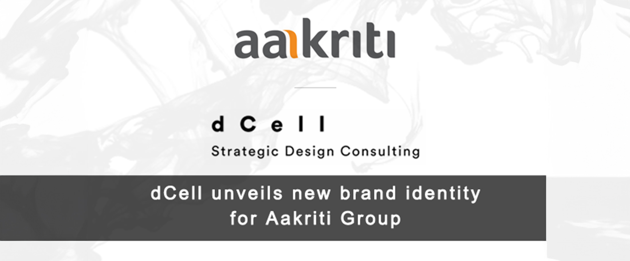
dCell, the strategic design consultancy division of Lowe Lintas + Partners, has successfully executed the re-branding of the AG8 Group back to its original name, Aakriti Group.
dCell, the strategic design consultancy division of Lowe Lintas + Partners, has successfully executed the re-branding of the AG8 Group back to its original name, Aakriti Group. Along with the name change, dCell was also instrumental in creating a new logo for Aakriti Group that resonates with the company’s belief of being future-ready.
Aakriti Group is one of the fastest growing realty groups in India. The brief given to dCell was to create an identity that best represents Aakriti’s aspirations and work philosophy of always being there for its customers, along their every step.
Hemant Kumar, CMD, Aakriti Group, said, “Though we had migrated to a new name just a few years back, there existed a strong residual emotional connect between our customers and the Aakriti name. Hence, it was only logical to go back to future.”
He further added, “We were happy to partner with dCell who helped us in this re-branding project in a very strategic, logical and creative way, delivering on all objectives set.”
In the new logo unit, one of the ‘a’s in the wordmark has been crafted to create a brand shorthand. This represents the relationship Aakriti shares with its stakeholders/customers, a strong inseparable bond. This is metaphorically expressed via a shadow to the letter ‘a’. A round lowercase typeface is used to create a wordmark that is warm, approachable and welcoming.
The colour system uses orange to lend vibrancy and represents optimism while grey symbolises reliability, solidity, intelligence and innovation. Having the shorthand integrated within the logotype creates a unique, personalised logo, with a strong personality that beautifully captures Aakriti’s work philosophy.
Arun Ahuja, VP, dCell, commented, “We have created a logo and a visual grammar that captures the people-centric philosophy that is at the very core of Aakriti’s ethos.”
A visual grammar that emanates from the new identity is extended to various consumer touch-points with the primary objective of recognition and brand building.
{"fill_in_all_required_fields":"Please fill in all required fields.","enter_valid_email":"Please enter valid email address.","something_went_wrong":"Something went wrong. Please refresh the page and try again.","submitting_no_longer_accepted":"Form submissions are no longer accepted. Please try again later.","token_has_expired":"This form has expired. Please refresh the page and try again.","must_agree_to_data_collection":"You must agree to our data collection terms to submit this form.","problem_with_submitted_data":"There was a problem with your form data. Please review your information and try again.","checkbox_icon_description":"checked checkbox","registration_successful":"Registration successful","thank_you_for_registering":"Thank you for registering for the report. You can now download the report.","download_report":"Download the Report"}