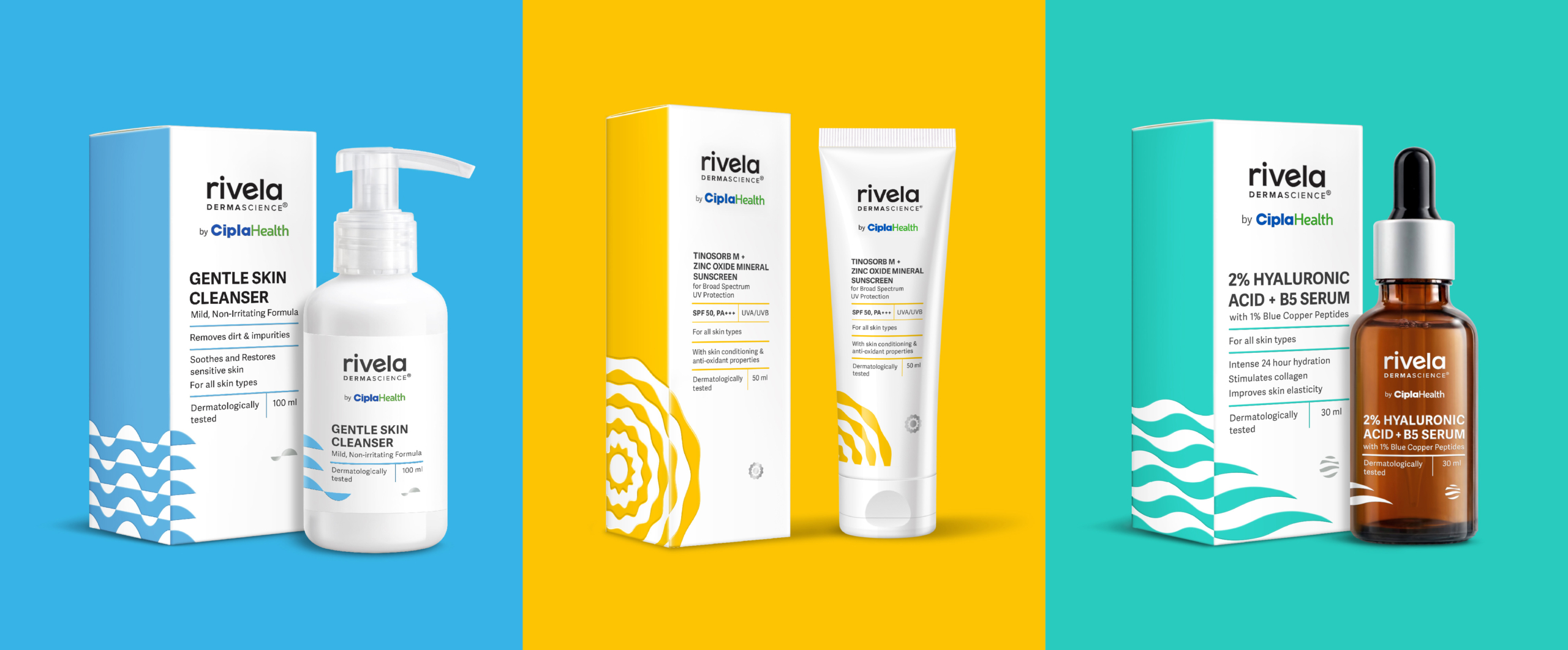
In a crowded and competitive skincare market, rebranding Rivela was all about creating packaging that clearly communicated ingredients and results. With Indian consumers becoming increasingly discerning, Cipla’s strong pharmaceutical heritage gave the brand a powerful edge.
We positioned Rivela as a science-backed skincare expert, bringing the idea of ‘DERMASCIENCE’ to life through clean, minimal pack design and sharp, structured lines. Inspired by traditional apothecary labels, the layout puts the spotlight on each product’s key active ingredient, making information easy to find and understand. While the front of the pack maintains a clinical, trustworthy look, bold geometric patterns on the side add a sense of energy and visual interest. These shapes aren’t just decorative—they reflect the function or benefit of the active ingredients inside.
The logotype is a crisp, sans-serif wordmark with a subtle quirk in the letter ‘e’, and it’s set in lowercase to reflect a modern, approachable personality. It strikes a balance between being innovative and remaining